Sacha Baron Cohen on Donald Trump’s Influence

Maureen Down from the New York Times interviewed Sacha Baron Cohen:

 “In 2005, you needed a character like Borat who was misogynist, racist, anti-Semitic to get people to reveal their inner prejudices,” he said. “Now those inner prejudices are overt. Racists are proud of being racists.’’ When the president is “an overt racist, an overt fascist,’’ he said, “it allows the rest of society to change their dialogue, too.”

Sacha Baron Cohen: This Time He’s Serious

Reeder 5 Delivers RSS in Style

Silvio Rizzi has released version five of his RSS reading app, Reeder. Reeder was the first great RSS reader on the iPhone. Version 5’s marquee feature is iCloud syncing across macOS and iOS devices, which obviates the requirement for an intermediary sync service, such as Feedbin or Feed Wrangler. It still supports such services, however.

Reeder 5 on macOS

Some people will howl that Reeder 5’s only real new feature is iCloud syncing. And if you don’t need that feature, you could probably stick with version 4. (I might argue that the new icon is a good enough reason, as is supporting a developer who makes great software for a very specific kind of newsmonger).

Reeder on iPadOS

But if you do, in fact, rely on a sync service, you’re likely paying way more than 4.99 USD (it’s $9.99 on the Mac App Store). I pay $4.99 monthly (happily, I will add) to Feedbin, and supported both Feed Wrangler and Feedly before that[1]. So even an annual release at these points would save you money. For the record, I purchased Reeder 3 in August of 2018 and version 4 in May of 2019.

Reeder supports a great custom UI on iPadOS, if that’s your thing. It’s super-smooth on an iPad Pro, too:


[2] I used Feedly’s free tier for a long time, but it bothered me… I grew to feel that if something is important enough to you, it’s worth paying for. And I missed Google Reader so much after it was retired that I didn’t want to go through that again. Is paying for Feedbin a guarantee of that? No. But I can’t blame myself if it does.


  1. 1  ↩
  2. 1  ↩

Smart Albums in Photos to Showcase Your Telephone, Wide, and Ultrawide iPhone Photos

Jason Snell, writing at Six Colors:

In the gray box found toward the top of the Info window, you’ll see some basic data about the photo. The first line indicates the device that took the photo—in my example, an iPhone 11 Pro. The second line displays which lens took the photo, and this is how you can sort out your photos from one another by lens used.

I’ve done something very similar to separate photos by phone model and even pics taken using my mirrorless. This is a very cool application of Photos and shows the power of a database applied to a creative endeavor.

Find photos taken by specific iPhone lenses

How To Copy the Path of Any File in Finder (Link)

Michael Kummer, with a great Finder feature I didn’t know about:

To try it out, just open Finder and right-click on any file or folder. What you will get is a context menu that allows you to execute certain functions on the selected item, such as copying it. Pay close attention what happens to the Copy “ITEM” menu entry when you press the OPTION key. It changes to Copy “ITEM” as Pathname.

How To Copy the Path of Any File in Finder

It Is What It Is

I have long harbored a distaste for the phrase “it is what it is.” I have called it a cliché, or more often, a tautology wrapped in a cliché. Most recently, our illustrious president used the phrase it perhaps its most nefarious, organizational-speak usage. In this case, it refers to a situation the speaker deems unchangeable.

Dr. Liane Gabora, writing for Psychology Today, took a look at “it is what it is.” Her takeaway is upbeat and faithful:

But then I realized that the phrase “it is what it is” is itself in a state of potentiality. In some contexts, it can indicate acceptance of complexity and ambiguity. In other contexts, it can indicate acceptance of limitations. It’s a phrase that may well have yet other shades or meaning, or be evolving new shades of meaning as I write this. It’s not one static thing. It is what it is.

This gets to my understanding of the phrase, when I would hear a superior steer a conversion away from something that the group was complaining about. “It is what it is,” and as such we shouldn’t spend any more cycles on it because we can’t change it.

I was listening to an episode of Upgrade with Jason Snell and Myke Hurley, and they were discussing the increasingly pitched battled between Epic and Apple over Fortnite’s inlcusion in the App Store. Jason, in describing the App Store, said that “it is what it is ” around the 32-minute mark. Of the Store, he noted that “Apple made it… its of a piece… it is what it is… It’s not hardware, it’s not software.”

In this case, it’s not necessarily a state of potentiality nor even ambiguous. But it is, by Snell’s conception, greater than the sum of its parts, and it defies easy analysis in a conversation such as what popped up around the Epic v Apple battle.

An article on Pain in the English posits an interesting hypothesis for the provenance of the phrase, suggesting that it may harken back to a phrase used by black Americans referring to systemic forces they saw as, in the immediate term, insurmountable. In common parlance, however, the writer offered this critique:

I dislike the vagueness of it, especially because wen [sic] people say it, they seem to imply it explains something, which it does not. It seems to be a weak vulgar shrug uttered by those who don’t know what else to say, and are baffled or confused themselves.

In addition to pointing out that “It is what it is” was USA Today’s cliché of the year in 2004, Guff Magazine critiques the hopelessness the phrase not only expresses, but inspires:

The effectiveness of “it is what it is” is that others can’t argue against it. No one can refute it. It stops short any constructive communication right in its tracks. If you ask a person why something can’t be accomplished and his or her response is, “It is what it is,” then there is no moving forward. It is an invisible, immovable barrier stronger than the Death Star’s deflector shield, and one that no Jedi can disable.*

Peter Economy, writing for Inc, describes its use in military and organizational applications:

It is what it is is an admission that the problem is too hard and suppresses the attitude that leads to creative, unseen solutions. Even if a leader racks his brain for a solution to the challenge, yet can’t find one…he should realize that his team contains a wealth of unique experiences and perspectives to contribute. It is what it is negates their value.

But what did Trump mean? He was referring to the deaths in the United States associated with COVID–19. In his usage, it was something that had passed. Those lives, sadly, have been lost. There’s no point discussing it, to Trump’s way of thinking, because it can’t be fixed. It is what it is.

So in the organization usage I referenced, and Trump’s usage, “It is what it is” is an argument to abandon hope. If something is what it is, it’s done. Over. At the very least, unchangeable. Can that be true? I suppose. Should you assume it’s true because someone in a position of power says so?

No.

Sixteen

My current employer was the first ever to provide me with a Mac, were I so inclined. (I was.) I have always had to buy my own PowerBook or MacBook and figure out how to do things like make it work with Entourage or connect to the district’s Exchange server. When I started in the Summer of 2016, though, I found a MacBook Adorable on my desk. The Adorable’s size and portability were perfect for what I needed, which was walk around to different schools and observe staff members and sit in on meetings. When at my desk, I plugged it into a display and benefitted from the productivity gains you realize with a large screen. It really did everything I needed, if sometimes a little slowly.

MacBook Adorable

MacBook Adorable

Fast-forward four years and I decided to try out a 16“ MacBook Pro when the option to upgrade came up. I had taken to carrying my iPad Pro around with me everywhere, and as Flash has been phased out by many of our software vendors, I was able to use (just about) all of our educational software on iPadOS. With a portable 12” device capable of doing just about everything I might need to do when out and about, I figured, why not try something ostentatious?

Sixteen, still boxed

Keyboard

I’m not one of those people who hated the butterfly keyboard on the Adorable, but I liked it a lot more conceptually than in actual usage. I had a 2013 MacBook Pro that I had bought for myself before coming into possession of the Adorable, and I very quickly found myself using the Pro when I was in the office because of the screen size and the keyboard. The Pro’s keys didn’t have the central stability of the Adorable’s, but they felt much better. The Adorable feels almost like you whacking on a touch screen keyboard: There’s a little key depression, but not much.

Sixteen's Chin

The Sixteen is quite possibly the best laptop keyboard I’ve ever typed on. The keys are centered and stable, but there’s a good bit of travel and an otherwise quiet and satisfying thunk when you depress a key. It is a much improved version of the keyboard I enjoyed on my 2011 MacBook Air and the 2013 Pro that replaced it. And you won’t disturb your officemates.

Keyboard

TouchBar

I like it. I wouldn’t so much were there not an escape key. I also could live without it. But it’s delightful to see what developers thought would make the best use of the tiny screen. In Excel, OmniFocus, and the Finder, there are thoughtful affordances built in. The TouchBar isn’t a reason to replace an older computer, but it is userful and an interesting rethinking of the function key row.

Distantly Related

Screen

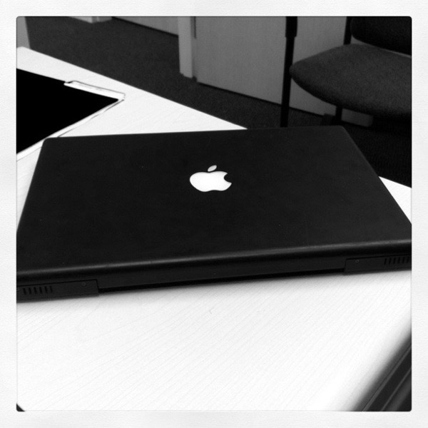
The Sixteen’s screen is glorious. Do you need it if you were happy with a 13“ screen? Probably not. But if you ever had a 15” PowerBook before the dawn of smaller screens, you cannot but help be transported back to that time. I had G4 Titanium and Aluminum PowerBooks in the early and mid-aughts, and while I never regretted moving to the (black polycarbonate) 13“ MacBook and later the Air and Pro, I do very much like this screen size. True, it’s luggable where the 13” is portable, but the Sixteen is still a boon companion on a jaunt outside of the office. It fits in my laptop bag, no sweat.

Blackbook

Other Stuff

  • The speakers are loud and clear for laptop speakers.

  • The trackpad is bigger than your iPhone. A lot bigger.

  • Touch ID came and went on the higher end iPhones and iPads, but it’s here in spades on the Sixteen. Logging in with your thumb or unlocking 1Password is a welcome affordance, especially if you don’t have an Apple Watch to unlock your Mac for you. If your’e used to Face ID, it can feel like a regression. Likewise, it’s not useful in clamshell mode, which is pretty much how I use my Apple notebooks at work.

  • It’s a beast, power-wise, for what I need. The only thing that I’ve done that’s gotten the fans blowing is recording an hour-long Google Meet.

  • My unit does not like operating in clamshell mode when connected to my Dell 27" display via HDMI and an Apple Thunderbolt dongle. Displayport to Thunderbolt is fine, though.

“He could not even protect himself”

President Trump has coronavirus:

Trump’s mishandling of the coronavirus defines his presidency. He downplayed the severity of the disease, misled the country repeatedly about it, tried to pin the blame on local governments, did not “take responsibility at all” for the anemic American response, held massive rallies against scientific advice, hammered on states to re-open before it was safe, rejected easy safety measures, and undermined trust in our public-health institutions. Trump was never going to protect the country from the virus. But ultimately he could not even protect himself.

Now What